Salesforce Scheduler Quality Overhaul
Improving User Experience fit & finish across 3 form factors and plugging user experience gaps
The Problem
When I first took over Salesforce Scheduler (f.k.a Lightning Scheduler), there were a whole host of issues that the product faced when it came to quality. The text was not consistent. Certain design elements were not mobile or tablet friendly. Element alignment was off… you name it and it was an issue. There were also a few parts of the experience that did not fundamentally make sense.
How we fixed it: Design Blitz
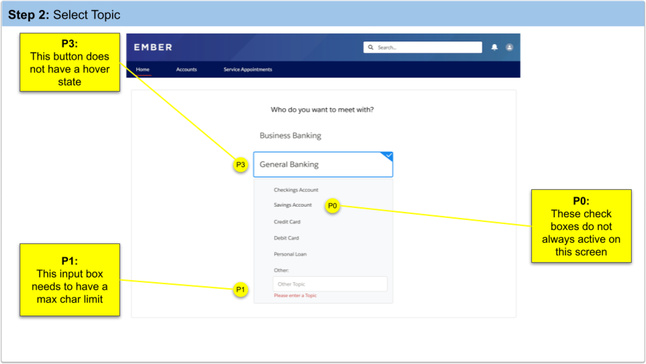
When engineers develop new products, it is customary for the whole team to come together and try out the new product to find bugs and other issues. At this point in our Salesforce design team’s journey, we had never done this. To fix our usability issues, I conducted a design blitz and involved multiple designers, PMs and front-end engineers to look closely at every single element on our Scheduler product.
How we did it:
We conduced this blitz by creating a slide deck that contained every single screen of our product on mobile, tablet and desktop and creating comments for every issue that we could find. For every issue or bug that we found, we would assign a priority level (P0, P1, P2, P3, P4) and sum up the totals at then end. Having a Google slide deck to this made it easy to collaborate asynchronously and also present our findings directly to UX leadership.


